Our Product Manager James shares how we’re rolling out new changes to our software’s user interface and still providing you with the best experience.
Companies can cause quite a stir rolling out dramatic changes to the look and feel of their software. After user backlash against providers like Google, Twitter and Facebook UX and UI design changes, it’s up to software developers to learn the key lessons about rolling out changes in a way that doesn’t upset customers. However, for every instance of user interface updates that have gone wrong, there are many success stories of companies doing it well!
In my update earlier this year about changes to Scout Talent software’s user interface, we considered: “why change?” Of course, we understand all too well the frustration users can feel when their product changes too quickly and dramatically. It can be painful and jarring.
We initially planned to roll out changes to you gradually. However, this created a somewhat more jarring experience than intended. We don’t want you to have to shift between old and new interfaces. (For example, we don’t want you to have to switch between a modern, clean and updated job page, then revert back to an “applications” page that hasn’t been updated.)
Which is why we’re taking a new approach to rolling out changes.
As we get closer to release updates, we’ll communicate key changes with you in a way that makes sense. Instead of rolling out changes gradually, we’ll release relevant changes together. We’ll communicate with you about how we’ve modernised the software, reduced clutter and ordered things in certain way based on data-driven decision making.
All of our users can now access the “Bento box” to view services, integrations and more. You can expect to see more changes like this, making your experience cleaner and easier.

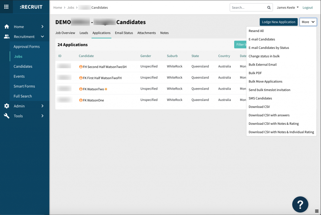
New Scout Talent user interface upgrade to “applications” page

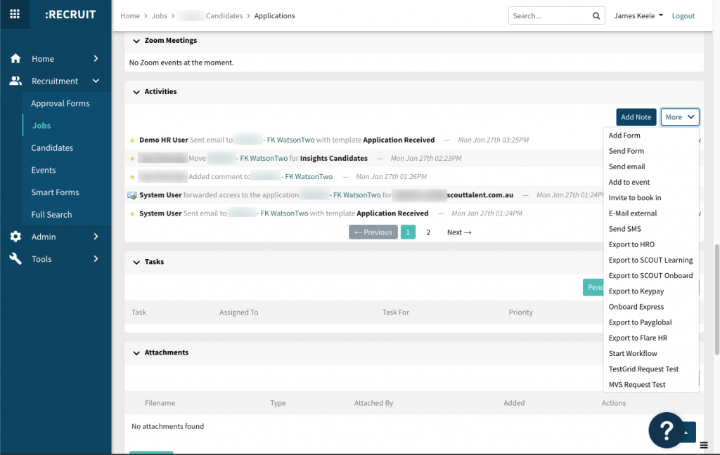
New Scout Talent user interface upgrade to “candidate application” page
In other news, we’re also in the middle of a significant infrastructure upgrade to improve the performance of our products to give you a better user experience. (This “future-proofing” work is kind of like reinforcing and upgrading the foundations of your house!). We’re using technology with improved capabilities, allowing us to have greater flexibility in writing software previously not available to us. This upgrade will result in faster load times and improved functionality.
Check out the “What’s New?” section on our website for a more detailed look at the changed we’ve released.
If you have any thoughts about our software’s new user interface, I’d love to hear your feedback personally. Feel free to share your thoughts with me at james.keele@scouttalent.com.au
I look forward to hearing from you!

James Keele
James Keele is the Product Manager for Scout Talent. He has a background in IT and Software Product Management specialising in the B2B space for the past 3+ years. James’ role is to manage Scout Talent’s product roadmap and software development, aligning them with the overall Scout Talent strategic vision. He is passionate about user experience, automation and the creative process of development.


