Each month, our Product Manager James shares insights into the exciting updates for Scout Talent software. In this edition, he explains the new User Interface (UI) our clients can expect in the coming months.
It’s always been my goal to assist users in making better decisions faster. In the software space, a huge part of this is ensuring that your User Interface (UI) and User Experience (UX) stay up to date and easy to use.
I could write a long article on the way that UI and UX impact both your use of software and your sentiment towards it (because I love this stuff!) but I’m sure you’re more interested in me showing you where we’re going with Scout Talent software.
In product management, it’s a wonderful being able to make data-driven decisions, which is exactly what we’ve done. This ensures we’re making design updates that are will be of the most benefit to you. My team and I are so excited to bring deliver these to you in the coming weeks and months.
Why change?
I understand all too well the frustration users can feel when their product changes too quickly and dramatically. It can be painful and jarring. Personally, I’ve disengaged from products I’ve used in the past for doing this.
Is now the part where I tell you that we’re going to completely overhaul Scout Talent: Recruit’s UI?
Don’t worry. We’re making changes, but to limit too much change happening at once, we’re making small, but significant changes over time to improve your experience.
Here’s the brief we gave to our designers and developers:
- Modernise – round off the edges, make things cleaner and easier to digest
- Reduce clutter – reduce distractions and extraneous decisions people have to make on any given page
- Use data-driven insights to show you what you need – provide easy access to the most popular features and functions
- Don’t get rid of anything – people are accustomed to the features they use, and we aren’t in the business of removing them.
Where are we going to start?
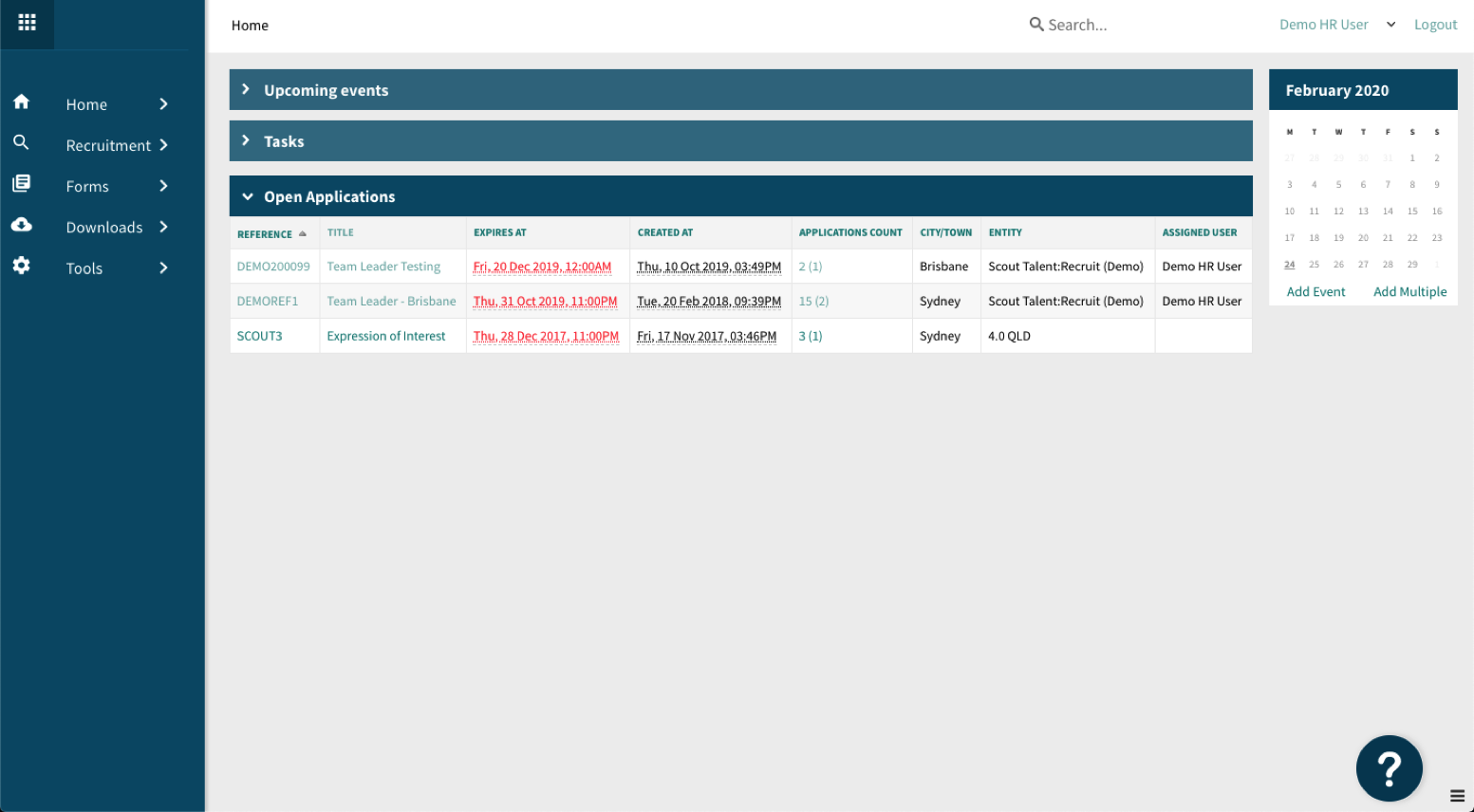
The first thing we’re going to change is the navigation menu on the left-hand side of the application. We’ll group items together logically to declutter this side of the page, giving you faster, easier access to the most popular menu items:
 What the new Scout Talent collapsed menu will look like.
This may seem like a small change to start with. But again, our goal is to make your life easier, so we won’t pull you away from your everyday operations.
What’s next?
The second area of updates will be a staged process.
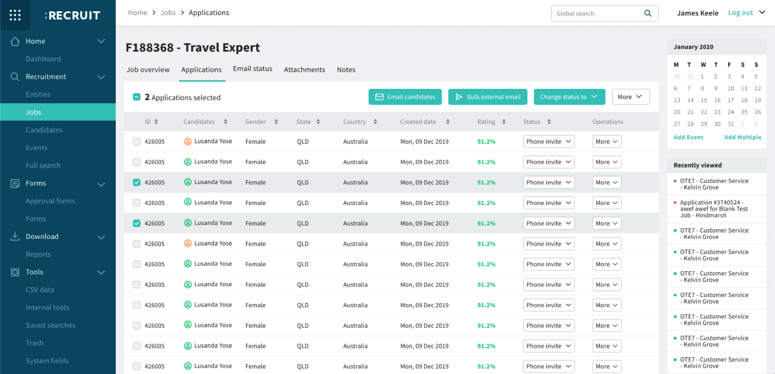
Tables, colours and the placement of items will be consistent, and we’ll reduce the clutter and give you access to the things you use the most.
 What the new Scout Talent menu will look like (collapsed menu, with all items now expanded). The new Scout Talent tables and colours will be consistent, with the most popular 3 items as buttons, with excess functions moving to the “More” dropdown menu.
As you can see, the most popular items will be represented as buttons, and the rest will be moved into the “More” dropdown menu. This gives you quick, simple access to the three buttons you use the most, with minimal distractions.
Everything will be consistent, in that if tables and buttons are updated in one section, the same changes will be reflected in all sections. (You won’t see a mix of the old UI and new UI in different sections!)
What’s that thing in the top left corner? (The nine dots that look like a bento box)
The nine dots you will see in the top left corner is something else we’ve been working on. We call it our Services and Integrations marketplace.
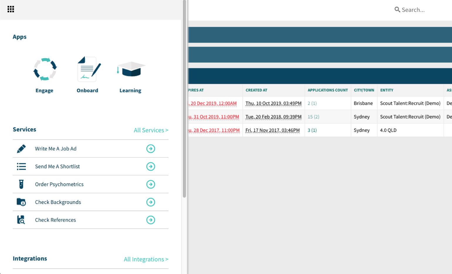
Just click the nine “dots” (the icon is called a Bento Box, strangely enough!) and it will expand a menu to reveal a range of products: a section for recruitment services and our integrations marketplace.
 Clicking on the nine dots, the “bento box”, will reveal Scout Talent’s new Services and Integrations marketplace.
This menu will become an important part of our User Interface changes moving forward. Why? At Scout Talent, we provide a range of specialist recruitment services and integrations that we want to be able to better present to you.
Our philosophy on recruitment services is this – no one can be all things to all people. If you need assistance in one area of your recruitment, for example, attracting more candidates, you can tap into Scout Talent specialist services whenever you need them.
Our Specialists can seamlessly plug into your recruitment process at any stage, from recruitment advertising and shortlisting & selection to employer branding, whenever you need an extra set of hands. (Find out more about our recruitment services here.)
For example, you might like support writing professional recruitment advertising copy or want recorded two-way video interviews to share with your team members, or background and reference checks. All of these services are performed by our experienced recruitment specialists, with your needs and brand front of mind.
For many services, you’ll be able to click a button, and we’ll step in to help.
In terms of integrations, we want to help you build your ideal “recruitment tech stack”, and show you the current integrations we have to make your life even easier.
When will these updates be rolled out?
We’ll be rolling out these changes in Mid-March. You’ll receive an in-app announcement and everyone will receive the new collapsed menu around this time.
You’ll definitely hear more from me about our new UI changes, and our Services and Integrations menu. In the meantime, I’d love to hear your feedback personally. Feel free to share your thoughts with me at james.keele@scouttalent.com.au
I look forward to hearing from you!

James Keele
James Keele is the Product Manager for Scout Talent. He has a background in IT and Software Product Management specialising in the B2B space for the past 3+ years. James’ role is to manage Scout Talent’s product roadmap and software development, aligning them with the overall Scout Talent strategic vision. He is passionate about user experience, automation and the creative process of development.


